This week, Ritva hosts a black-and-white challenge, one of my favorite genres; however, she adds an extra bit of spice. She writes, “At Lens-Artists, we’ve explored minimalism and black-and-white photography separately, each offering its unique perspective and emotional depth, but when these two styles are combined, they create a powerful and engaging atmosphere that resonates deeply with us on multiple levels.” You can read her entire challenge post here.
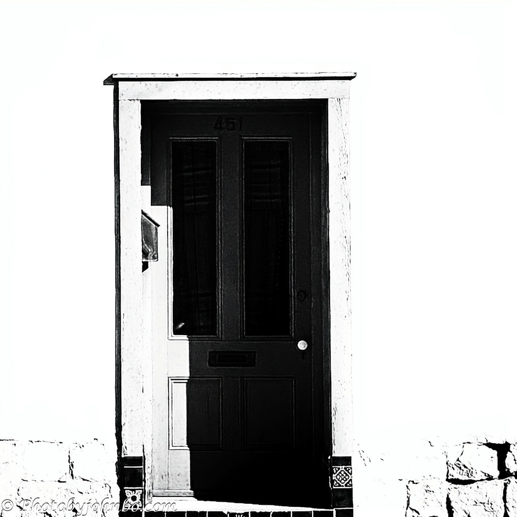
I begin with the most extreme example of black-and-white minimalism rolled into a single image. Over the weekend, we visited Barrio Viejo—a Tucson neighborhood with the largest surviving collection of adobe row houses in the United States. Its doors, whether weathered, decorated, or boldly stylized, draw photographers and artists alike. My first door is a study in high-contrast architectural minimalism, offering just enough detail to suggest a doorway.

This door offers a quiet lesson in style and craftsmanship. Its beautifully weathered surface may have endured over a century of Arizona sun—or perhaps it was restored with its original character preserved. I’ll never know for sure. What I do know is that, in converting to black and white, the texture and tonal contrast had to remain untouched, honoring the story etched into its grain.

Barrio Viejo’s adobe row houses date back to the mid‑1800s, built in the Sonoran tradition and later adapted as new influences arrived in Tucson. Their thick walls, simple lines, and repeating facades create a natural rhythm that works well in black and white. The lack of ornamentation puts the focus on shape, shadow, and texture. This final door, with its paired design and matching fixtures, clearly shows the pattern. With the architectural series complete, I shift to a different kind of minimalism—one created by apparent motion rather than structure.

The Adamski style is a form of minimalism built on motion, abstraction, and soft tonal transitions, usually created through intentional camera movement. In this case, I simulated the effect in post‑processing by applying directional motion blur to the background and then layering the sharply focused subject back on top. The result keeps the essence of the technique—smooth, blended tones and a simplified horizon—while giving me full control over the final composition. A black‑and‑white conversion in Silver Efex 3 completed the process.

As a fan of classic cars and professional auto auctions like Mecum and Barrett-Jackson, I always take a camera. While wandering among the cars for sale, I try to keep my photos from all looking the same. Minimalism helps. Sometimes it’s a chrome strip, a hood ornament, or—like in this case—the entire front end. This Edsel, with its bold vertical grille and mirrored headlights, offered perfect symmetry and strong industrial lines. In black and white, the chrome pops, the shadows deepen, and the design becomes the subject. It’s minimalism through repetition and reflection.

This image is an example of detail minimalism—not because the frame is empty, but because the subject stands out with purpose. The tail fin and taillight are the focus. Their bold shape, chrome detail, and vintage styling carry the whole frame. The background has some reflection and blur, but it doesn’t distract—it supports. That’s what I mean by detail minimalism: one strong element doing all the work. The conversion to black and white, along with a strong vignette, adds drama to the tail fin, a design element so prominent in the mid-20th century.

Low‑key organic minimalism follows the same principles as its man‑made counterparts, but the source of simplicity shifts from engineered lines to nature’s own design. Instead of isolating a mechanical structure or architectural edge, this approach focuses on a single living form—here, the peace lily’s textured center spike and its elegant, hood-like white leaf. The nearby waterfall softens into darkness behind it. A lowered exposure setting and dark vignette create the same intentional separation used throughout this challenge response.
It’s time to put a pin in my response to this week’s challenge. Ritva’s unique blend of photographic styles made this one a pleasure—both in taking a few new images and in revisiting others that I reprocessed specifically for her theme. For those who enjoy pixel‑peeping or digging into metadata, the full gallery is available in 2K HD on my Flickr site here.
Last week, Anne hosted the Lens-Artists challenge featuring “What’s Around the Corner?” It was a treat to see everyone’s neighborhood views from their walk around the block. The next challenge drops on Saturday, January 24, at noon Eastern time. Egidio will be hosting, so be sure to follow him here so you don’t miss his post when it goes live. If you’d like to join in with your own photos, you can find more information here.
John Steiner

John, lovely gallery of images, but the Beach Scene is SO good, it not something I would be able do, hats of to you.
Thanks, Ritva! This is a fun challenge.
I thought you were going full on Thursday Doors at first, John. Love that beach scene treatment xx
I forgot about Thursday Doors…. I sure could have. Last weekend, I photographed many more doors than the three I picked. >grin<
The doors and the beach scene are my favourites John 😀
Thanks, Brian!
Beautiful collection John, the doors are very cool processed to black and white, the beach shot is my favorite, awesome!
Thanks, Pamela!
Great job John.
Thanks, Rupali!
Barrio Viejo looks like somewhere I would enjoy photographing 🙂 I like the clean lines and simplicity you’ve captured in the architecture there. I also love your Adamski edit – that’s probably my favourite in this selection!
Thanks, Sarah! I like the Adamski style, and with post processing tools these days, it’s much easier to simulate.
Once again, worth waiting for. Amazing images. The doors are an excellent subject for showing texture in a way that only black and white can. And, the beach scene created during processing–wow!
Thanks, Anne! I really enjoyed the black-and-white processing for this challenge.
😊
That beach scene is absolutly stunning. A perfect B & W minimalist image.
Thanks, Vicki! It turned out better than the color version I did awhile back… even if I say so myself. >grin<
Well done John. I especially like the beach scene and Edsel grill.
Thanks, Brad!
Love the auto details!
Thanks, Sandy!
I have a zillion photos of parts of cars from the auctions. Maybe some day I’ll share a collection of black-and-whites in a single post. (Not a zillion, maybe six or so.) >grin<
John, these are all amazing! My favorites are the door in the first image, the beach scene, and the Oldsmobile taillight.
Thanks, Beth! This was a fun challenge for me.
I had never heard of the Adamski style of minimalism and I love the results of your editing. I’ll have to look into it and give it a try. Thanks. 😊
Thanks, Pepper. A couple of years ago, I started experimenting with the effect. I have several examples from a post in June 2023.
Well John, you’ve given us a lesson on the many choices available to create a minimalist image. I loved your beach scene and the Edsel especially
Thanks, Tina! I really enjoyed working Ritva’s challenge.
Amazing – of course, John! What can I say – the Adamski picture is so very good…I tried with your description, but failed. Love yours!
It took me a while to get good results from my attempts. Keep at it, I’m sure you’ll find it a fun way to process an image.
Hopefully!
I liked the taillight picture best, John. It was almost like I got a feel for the personality of the car as it gazed at the world.
I found the black-and-white edit made the taillight other-worldly, an alien looking at us with that big eye. >grin<
The color version looked like a taillight on a tailfin.
Fantastic gallery, John. The Adamski effect, the cars and the lily are outstanding.
Thanks, Egidio! I really enjoyed working on the photos for Ritva’s challenge.
Thee are great examples with explanations. Since I’m a fan of the beach – that one is my favorite!
Thanks, Nora! I saw that from your first photo. >grin<
Great photos, and as many have said, the beach scene is amazing!
Thanks, J ‘n’ J!
The beach scene is amazingly wonderful 🙂
Thanks, Hammad!!
The Oldsmobile! I had a 1959 Oldsmobile that looked a lot like that!
The car in the photo is a 1959. As a college kid, I had a 1959 Chevy. This was in 1970.
Be still my heart. I thought that oval fin light and curve of the glass looked familiar. ❤
How long did you keep your 59 Chevy?
Probably 3 to 4 years until the transmission died.
🥲
Love the doors – but all great images
Thanks!!
Wow, John, your Barrio Viejo collection is stunning!
Thanks, Sofia! It was a timely excursion for the challenge.
Perfection 🙂