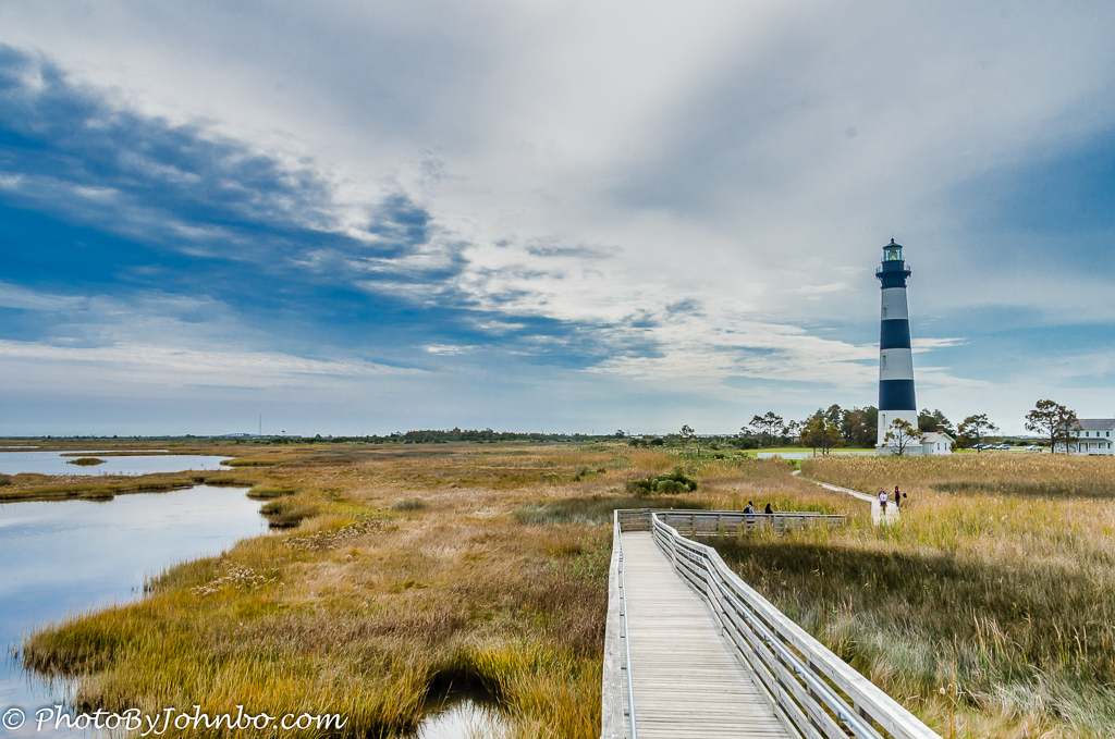
This week, Patti challenges us to think about the foreground, middle ground, and background when composing in‑camera. She writes, “When I take a photo walk, I often look for ways to frame the shot to make it more ‘inviting.’ In other words, I look for something that draws my eyes into the scene like bright colors or a brilliant sunset, for example, and invites me to linger and take in all the details. This week, we’re focusing on one technique: framing the shot using the 3 grounds (or layers)—the foreground, the middle ground, and the background.” You can read her entire challenge post here. My featured image uses a strong leading line to draw the viewer into the scene, but it’s the three layers themselves that do the real framing: the boardwalk in the foreground, the marsh and walkers in the middle ground, and the lighthouse anchoring the background.

This photo has a personal story behind it. On our way to Wickenburg, we stopped at the Hassayampa River Preserve to explore the riparian habitat. I don’t claim to be a birder, but when a bright red bird with dark brown wings darted from perch to perch, I couldn’t resist the challenge. After a bit of patient following, I finally captured this moment. I didn’t even know what I’d photographed, so when we met a group of birders who had been searching for the same bird all morning, I showed them the image on my camera. One glance at the display, and one of them exclaimed, “He photographed the Vermilion Flycatcher!”
For this week’s challenge, the image fits neatly into the theme of foreground, middle ground, and background. The weathered stump anchors the foreground, the softly lit tree behind the bird forms the middle ground, and the circular green bokeh creates a gentle background that lets the flycatcher stand out. I cropped the image square to shift the bird off‑center so he appears to be looking into the frame, adding a bit more visual tension and balance.

For my third example, I wanted to show how changing your viewpoint can dramatically alter the relationship between the three layers. I photographed the statue of Queen Victoria at Kensington Palace from several angles, each one shifting the balance between foreground, middle ground, and background. In the first image, the queen anchors the right side of the frame, with the lawn stretching across the midground and the palace rising behind her. In the second, I moved the statue to the left, which changes the visual weight and opens more space toward the palace. The third version is a two‑image panorama that widens the scene and gives equal presence to both the statue and the palace. This composition also moves the statue toward the middle ground, revealing more of the water feature.

I chose the first image for the challenge; even though it trims the right side of the palace, it also removes the distracting fences and groundskeepers visible in the other two views. I prefer how the statue leads the viewer into the frame from the foreground, and the slight asymmetry adds a touch of visual tension. I’m curious which of the three you would choose.
That’s all for my challenge response this week, focusing on Patti’s theme of framing the shot. All of the images, including full‑resolution versions of the three Kensington Palace photos, are in my Flickr gallery here. Last week, Tina featured a challenge I embraced fully—phone photography. Next week, Sofia returns with her challenge on Saturday, April 11th, at noon Eastern Time. Be sure to follow her here so you don’t miss her announcement. If you’d like to join in our challenge with responses on your own blog, the details are here.
John Steiner

A single bright bird – that’s a winner everytime. No discussion. But I really liked your three different views of Kensington garden. Great illustration!